
Corporate Identity | Office-Set Design
Photo & Design Studio Graphic Design Studio
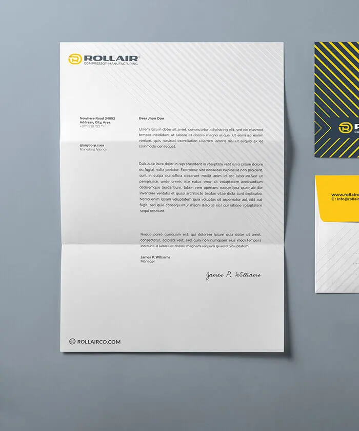
office papers or office set Refers to the collection of letterheads, business cards, and envelopes. Additionally, items such as note papers, flash cards, credit / personnel cards, equipment labels and … can also be designed. The elements placed in the letterhead should have margins with the edge of the paper. These margins should not be less than one centimeter. In graphical designing of letterheads, care must be taken to leave the background as colorless as possible. Failure to observe this could lead to dark, low quality, and unusable copies when photocopying or faxing. The graphics designed for letterheads should not present difficulties for writing and reading. Lastly, depending on the subject domain, and also based on the customer’s opinion, these limitations could be lightened and letterheads with various cut sizes and diverse graphics could be allowed.
")
The A5 sized letterheads (21×14.8 cm2) are the second most used next to the A4 sized ones. This cut size is used primarily for internal correspondence or short texts. It should be
noted that although the dimensions of the A5 letterhead is half that of A4, the visual elements should not be scaled down proportionally, but the font and dimensions for the visual elements should be chosen again with accuracy. Graphical design in different cut sizes are usually the same and do not differ substantially.
Business cards are cards, with the standard dimensions of 5×9 cm2, made of paper boards with different weight. In fact business cards are the first advertising maneuver on an idividual’s part for an issue. Visual elements typically used in business cards include emblem and title, brief information about domain, and contact details. The orientation of the business card (landscape vs portrait) depends on the nature of the images and texts. When designing business cards, some space should be left blank for holding between fingers.
Name, logo, address, the phone and the fax number, the email address of the company, also the number of letter and the date of the appendix in the header are the essential writing elements and standardly/undoubtedly they should be considered in all forms’ headers. It is obvious that the location of the logo on the letterhead should not harm the main usage (the necessity of writing text on it) of the letterhead. Alignment of the address line, depending on other visual factors, can be left-, right-, or center-aligned, or it might even be non-aligned and unconventional.
Envelope: dimensions of the envelope are usually proportionate to those of the letterhead (A4). The dimensions of the closed envelope would better be one third the height of the letterhead plus six millimeters (in width and height).
Address, telephone number, name, logo of the company, fax, website, and email address are the necessary items on the envelope. In fact, text is considered to attract the audience’s eyes. The logo and the title are usually located on the top left. The elements are mostly laid out in landscape orientation.
It should be noted that an empty space should be left on top right of the envelope for attaching postage stamp and postal service operations but if the postage costs are already paid for in advance, this part could be used as well. Leaving this space blank means not to insert text or images such as the logo, but using ornamental curves or lines and decorations is allowed.
An important point in the design of office paper set is the necessity of visual harmony in all products. In other words a specific identity should exist in letterheads, business cards, envelopes, personnel cards …
This common visual identity can be formed by presenting common decorative visual elements, through a coloring scheme, or a similar layout … Usually the starting point for the design of office paper set is the letterhead or the business card, and then, based on the initial pattern, other items are conceived. Changes or revisions on the already completed works are possible at any stage.

PHOTO & DESIGN studio is an advertising and marketing firm that is working towards growing the advertising industry in Iran. We are relying on our knowledgeable and experienced experts, and also partnership with world class firms, when needed, to provide innovative solutions to our clients.
Select your language
Design Studio
Photography Studio
Keep in Touch