
Logo | Sign | Brand Design
Photo & Design Studio Graphic Design Studio
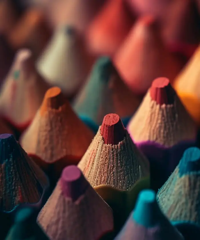
Logo is a symbol or representation of a trademark, so it's design is of crucial importance. A well designed logo will be a powerful and an invaluable representation of a commercial word mark. Therefore designing an effective logo for a
trademark requires more innovation and tremendous effort compared to other forms of graphic artwork.
Logo or word mark is a symbolic representation of a phrase or a vehicle for a concept. Logo resembles a signature in that it represents a trademark or the owner much in the same way as the signature represents a real person. A logo lingers where the owner, including a person or an organization, has passed and implies their trace. Logo is a graphical sign or emblem that investors or institutions or individuals use to distinguish themselves from other people in public. Logos are graphical entities (symbol or icon) or they are composed of the commercial name of the organization or the institution.
")
LOGOSICONIC | SYMBOLIC
Icons and symbols are compelling yet uncomplicated images that are emblematic of a particular company or product. They use imagery that conveys a literal or abstract representation of your organization. Symbols are less direct than straight text, leaving room for broader interpretation of what the organization represents. In order for a symbol to be a truly effective logo, it should conform to these maxims:
- Instantaneously recognizable
- Memorable
- Clarity when reproduced in small sizes
- Can be illustrative in nature, either concrete or abstract
like: Apple, Nike, Disney, MSN, Cingular, Shell, Volksvagen, NBC
Throughout the history, “symbol” which is a type of unique sign for visual identity, has been used as a medium for communication. It is believed that prehistory human intended to warn or to inform others or to convey other messages by engraving on the walls of Altamira cave in Spain and Lasko cave in France. Archeologists have found some tools from ancient Greek on which some drawings and symbols like letters and colors can arouse certain sensitive reactions. The meaning of the symbols relates to a religion that is representative of its creator. Symbolic drawings are carved on the Egyptian coffins that probably carry the trace of their creator artist. In medieval societies, merchants and craftsmen used their own special emblems and symbols representing the owners to identify their goods or products. The printers of the late nineteenth century, proud of their dexterity and skills, printed symbols in alphabetic signs or signatures on all of their printed drawings which were indications of their proficiency and skill. Also, in the beginning of the twentieth century, American cowboys used exclusive marks for branding their livestock to identify the owners; in fact, they used a type of visual language whose history traced back to ancient Egypt.
LOGOTYPE | WORDMARK
A logotype, commonly known in the design industry as a "word mark", incorporates your company or brand name into a uniquely styled type font treatment. Type fonts come in thousands of possible variations, shapes, sizes, and styles, each conveying a slightly different impression upon your intended audience. Script fonts imply a sense of formality and refinement. Thick fonts proclaim strength and power, whereas slanted type fonts impart a sense of motion or movement. Type font treatments can also include hand-drawn letters, characters or symbols that have been rendered in such a way as to intrigue the eye and capture the interest. Images can also be integrated into a logotype, often to great visual effect. Of prime consideration when selecting a logotype or wordmark is legibility and ease of recognition, even when reduced to the size required for printing your business cards.
Like: Dell, NASA, RayBan, Fedex, IBM, Mossimo, CNN
Logotype design: one of the most important factors and sometimes the most important tools used by designers to form a special identity is logo. Logotype or a written emblem is often a particular name for a company, a collection, goods and sometimes even a meaningless manuscript which is usually presented with a special and different design to settle in the minds. To catch a glimpse of official papers, the very first thing that meets the audience’s eye is the logo. As it concerns the utility, logos should be recognizable by the audience. So, in logo designing, legibility and distinction from other related logos is a principle. A logo should be comprehensible, impressive and it should be remembered by the viewer. Logo is considered a credible asset of a company to such an extent that it tends to survive growth or expansion of the business.
COMBINATION MARKS
are graphics with both text and a symbol/icon that signifies the brand image that you wish to project for your company or organization. Concise text can complement an icon or symbol, providing supplemental clarity as to what your enterprise is all about. There are integrated and stand alone combination marks. For instance, Starbucks logo has the text with the graphic integrated, whereas the AT&T logo has the icon separate from the text.
like: McDonald's, TiVo, Starbucks, Reebok, Pringles, Domino's, AT&T, Ola
THE GENERAL PRINCIPLES WHICH SHOULD BE TAKEN INTO CONSIDERATION IN A LOGO DESIGN ARE AS FOLLOWS:
- It should be simple.
- It should be consistent with the culture of the subject.
- It should have the convertible into monochromatic (today, some logos are designed for a product or services that do not need monochromatic convertibility; pay attention to long-term application of the logo).
- It should have the capability to be miniaturized to 1 centimeter dimensions.
- Preferably it should have a geometrical form.
- The resolution of the used elements should be taken into account.
- The proportions of the used elements should be thoroughly noted.
- It should be unique.
The symbols in logo and word mark design: today, because of restriction in the number of used letters in designing a well-designed logo, a combination of letters and logo is being used. These symbols like graphic signs in train stations, airports, streets or other public spaces might be based on the traditional writing. These symbols are seen everywhere from the coating of the packages, the bottles, the boxes, the body of the vehicles, the papers, the demonstration placards, in public games, in marketplaces, in fairs and festivals. Since the documented evidence suggests that the usage of symbols since the dawn of civilization dates back to long ago, it will not be altogether pointless to take a look at the history of human communication mechanics. Approximately 40000 years ago, when man survived by hunting, he carved graphical signs on cliffs to try to convey his thoughts and desires through pictures. So, the thoughts which were conveyed via voice or gestures obtained the capability of being registered and stably inscribed.

PHOTO & DESIGN studio is an advertising and marketing firm that is working towards growing the advertising industry in Iran. We are relying on our knowledgeable and experienced experts, and also partnership with world class firms, when needed, to provide innovative solutions to our clients.
Select your language
Design Studio
Photography Studio
Keep in Touch