THE BRAND

The brand identity for Libratica had to fuel recognition while providing visual differentiation. We decided custom typography was required for this high-visibility brand. All elements were intentionally designed to advance the brand strategy and to work together as a whole. A style guide was also created for Libratica to provide a support system of color, imagery, typography and composition that makes all brand communications cohesive and differentiated.

A Modern & Contemporary Website

The complete design kept a minimalistic look but the colors and typography gave the more modern and contemporary look they were after. The Libratica’s website had to strike a fine balance between approachability and authority. To accomplish this, we combined portfolio photos, navigation inspired icons and a vibrant palette for a cohesive and informative experience. For the logo we used the simplicity of the product itself as a reference point for the website. Our approach was to create simple yet stunning design. The logo shows its strength and its steadfastness.

YES, IT IS RESPONSIVE

Considering the brand’s target audience and viewing consumption it was essential to have the website look great on various devices. Responsive web design continues to be the standard option in providing visitors with an optimal viewing experience on various devices. With Libratica it was essential that viewers are able to explore efficiently on their mobile phones.

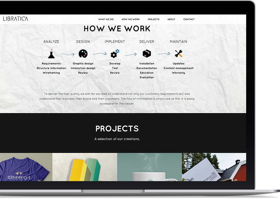
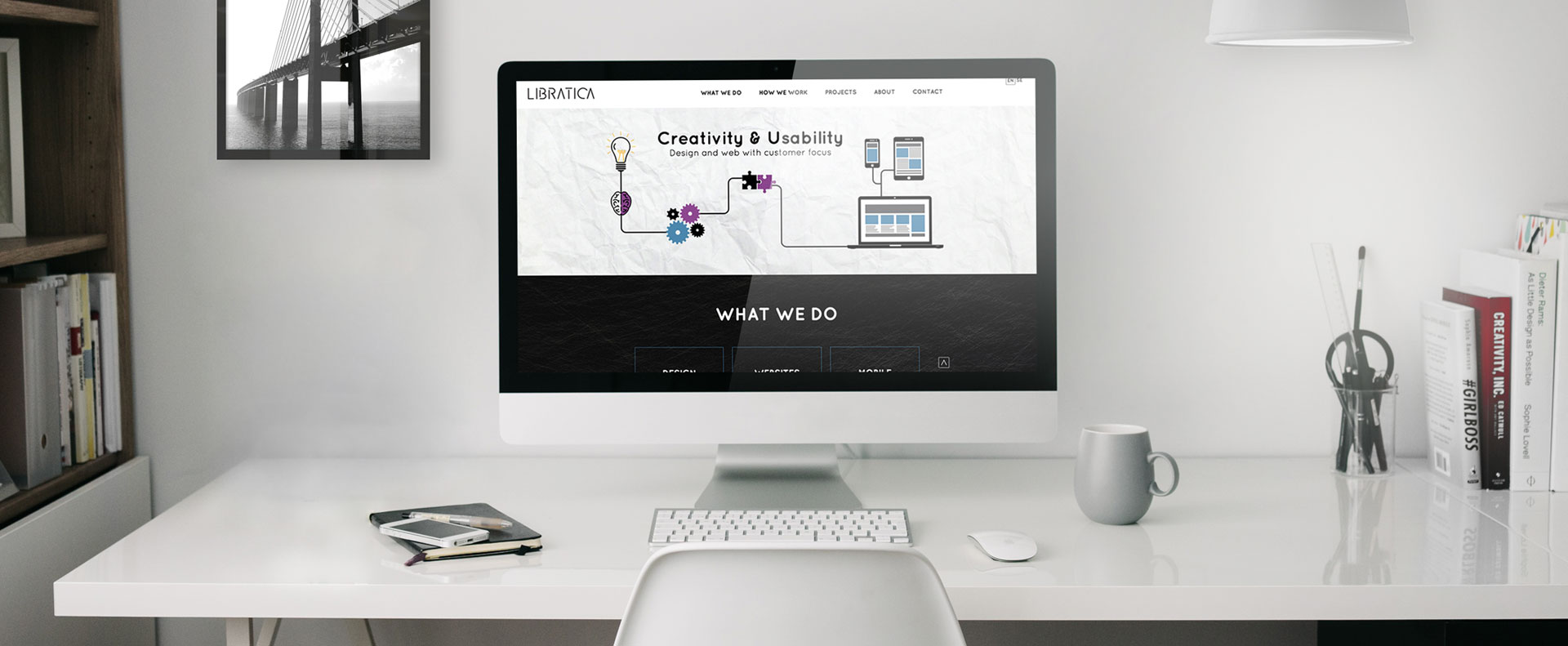
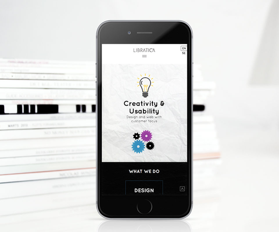
INFORGRAPHIC, AS A BANNER

We decided to avoid using the same old photo banner for the website, and instead make it more interesting by including infographics. We also used animation to make it more fun. This allowed the overall website to maintain a cohesive look and feel in both appearance and functionality

RELATED WORKS